I thought I would walk you through the steps I took to get one of my favorite moments and pics of the day. So here we go...
I had my 50mm/1.8 lens on my camera. Looking back I probably should have use another lens since his quick little movements created a lot problems with getting him in the sharp 'in focus' area long enough to push the shutter. Oh well, what did I expect from a 15 month old!
I was in manual mode on my camera at ISO 100, f/3.5 and 60th of a second. My flash was off to my right and not really in position, yet. But it was enough to, at least, cut the gray clouds and give me a little shadowing.
Here is the picture as shot:

Normally I go straight to Lightroom first. This time I went to Photoshop. The first thing I did was adjust the skin tone. I noticed two things in the skin.
1) It was slightly cold out so his nose, lips, cheeks and hands were getting red.
2) The reflection of the bright yellow toy creates a really green/blue shadow.
After deciding I was okay with those problems I moved on to fixing his little bags under his eyes. The cold wasn't helping them this morning (but he is still CUTE!).
Here is the picture with the skin tone fixed and the eyes shadows slightly toned back:
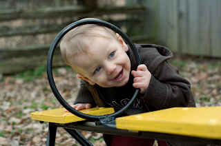
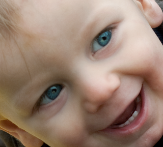
Next I moved on to brightening his eyes. I pushed the blue color a bit more than probably 'real life' eyes in cloud gray weather. But I wanted them to sparkle! I did a layer of sharpening and one for color.
Then I decided I wanted to warm the image up a little. The blue/green "correction" wasn't working for me. I added a solid color layer over top (sort of like a CTO gel color) and set that layers blend mode to COLOR. I pulled the opacity way back to 10%.
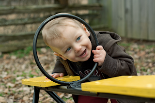
Finally, after this final color adjustment was made I felt like I wanted to do some work on the shadow/hightlights. It was getting too contrasty for me. It brought out some more detail hiding in the blacks.
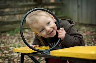
I darken up the edges a little. I'm NOT one to really go hog-wild with my edge burning. I think people do WAY too much of that these days. If you go too far with it, it just ends up looking yuck. There is a place for going really far and having dark edges! But generally, I don't like it. That's just my opinion.
Here is the final image.

1 comment:
Yikes! I understood nothing but that's OK. That's what I have you for. :-)
Post a Comment